Insurance Australia Group (IAG)
Scaling Design Systems for multi-brand web experiences


Role
Lead UX/UI Designer
/ Design Systems SME
Team
3 UX/UI Designers
7 Engineers
2 QE
2 Business Analysts
1 Integration Manager / PM
My contribution
Token Architecture & Foundations
Multi-brand Patterns
Component Semantics & Interaction Patterns
Flagship Brand Redesigns (NRMA, CGU, IAG, AMI, State NZ)
Timeline
16 months
Overview
Challenge
Solution
My Role
Discovery
Discovery Activities
- Conducted 15+ customer interviews and surveys across car and home insurance
- Shadowed contact centre teams to understand real questions, friction points, and FAQs
- Analysed analytics and session replays to identify drop-off hotspots
- Reviewed hundreds of customer reviews to surface recurring pain points
Key Insights
- Customers were not “browsing”, intent to purchase was high
- Coverage selection, not price, was the primary point of hesitation
- Long forms, dense tables, and jargon reduced confidence
- Mobile users struggled most with cognitive load
Strategic Reframe
The challenge shifted from driving more traffic to designing clearer, more supportive journeys delivered through a reusable system of patterns.

Challenge
Observed Challenges
- Long, inconsistent quote journeys
- Dense coverage tables + jargon-heavy copy
- High drop-off at Landing → Start Quote → Coverage
- No shared component library
Operational Impact
- No shared component library across brands
- Slow delivery and repeated rework
- Low confidence for customers starting and completing quotes
To create sustainable impact, the acquisition experience and the underlying design system had to be redesigned together.

Design System: Strategy & Implementation
I built the design system featuring typography, color styles, layouts, components and variables for fast implementations of new designs. Variables were built in collaboration with engineering so that we could use the same variable names across Figma and code.
System Strategy
- Led a comprehensive audit of 12 brand websites and apps
- Identified shared UX patterns, component overlap, and inconsistencies
- Defined a unified library of reusable components including forms and inputs, coverage and comparison cards, calls-to-action and modules
Tokenised Foundations
- Partnered closely with engineering to implement tokenised design foundations
- Consolidated ~1,200 legacy variables into ~350 design tokens
- Covered colour, typography, spacing, and interaction
- Achieved ~99% design-to-code parity
Platform Enablement
- Built as shared AEM component libraries
- Enabled parallel adoption across brands
- Used NRMA acquisition as the flagship validation journey
The result was one system that could support distinct brands without re-designing from scratch.


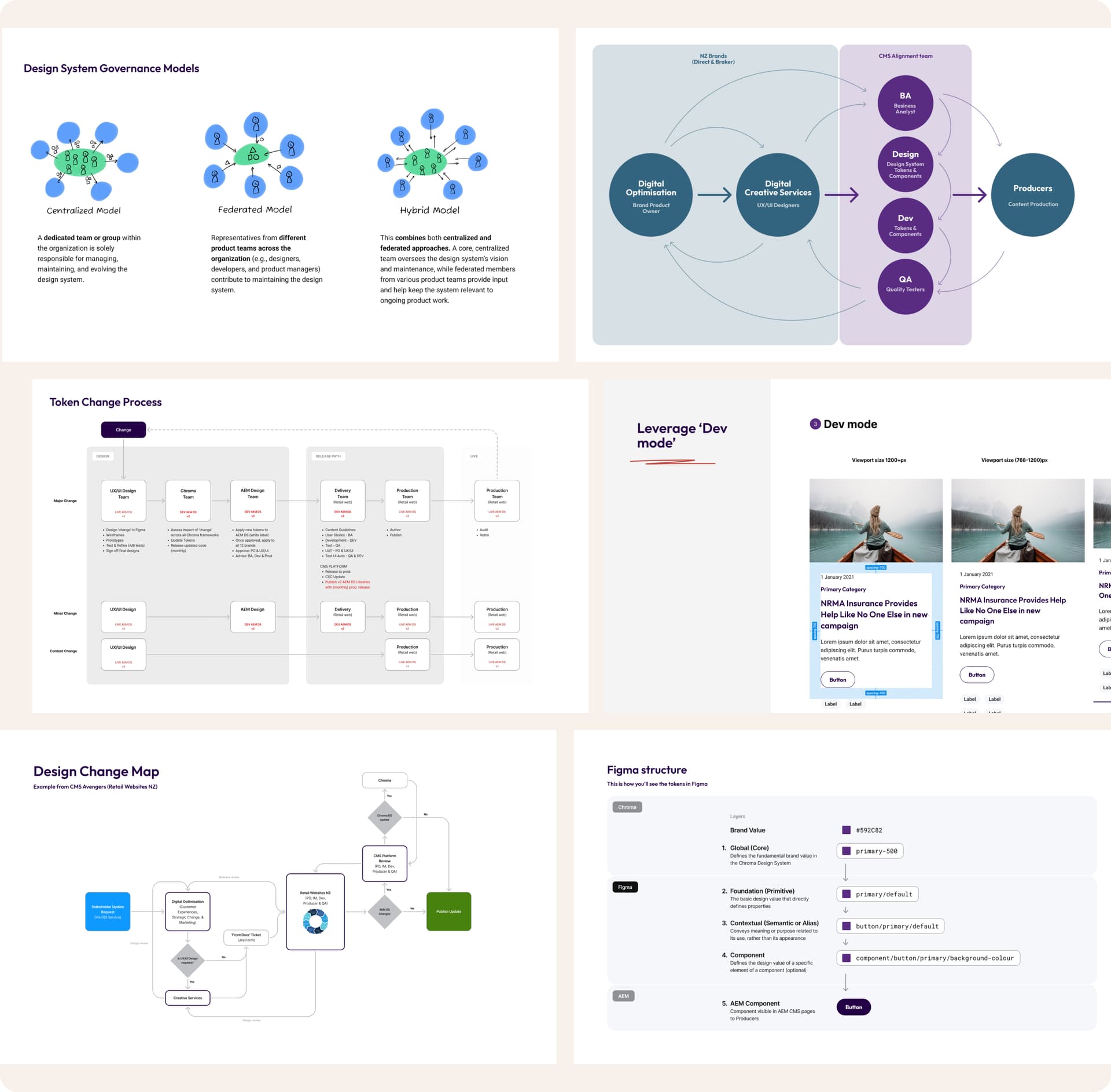
Governance
Why Governance Mattered
- Prevented fragmentation as adoption scaled
- Enabled safe, transparent system evolution
- Reduced ad-hoc decision-making and rework
Governance Model
- Co-designed a hybrid governance approach with design, engineering, content, and brand
- Defined clear roles, responsibilities, and decision pathways
- Established an end-to-end token and component change process
Adoption & Enablement
- Introduced contribution guidelines for product teams
- Established rituals including office hours, reviews, and show-and-tells
- Mentored designers and content teams on “designing with the system”
This governance model made design system decisions transparent, predictable and inclusive instead of ad-hoc.

Solution
Journey Redesign
- Rebuilt the acquisition flow from Landing → Quote start → Coverage selection
- Introduced progressive disclosure and contextual help
- Applied auto-filled defaults to reduce effort
Key UX Improvements
- “Help me choose” guided flow explaining cover types in plain English
- Mobile-first layouts with scannable cards and clear hierarchy
- Clear progress indicators to reduce cognitive load
System Validation
- Entire journey built using shared system components
- WCAG accessibility standards met
- Proven reusable across brands and products
This deep dive de-risked the system and gave stakeholders tangible proof of its value in a mission-critical journey.

Multi-brand at Scale
Once the foundations and governance were in place, we focused on making the system truly multi-brand. Instead of maintaining 12 separate libraries, we created a shared core of components and wired brand expression through tokens; colour, typography, imagery and tone.
Working side-by-side with engineering, we connected these tokens directly into AEM so that switching from NRMA to CGU, AMI or NZI became a matter of changing a theme, not redesigning a page. Brand teams kept their distinct identities, while product teams finally worked from the same, trusted building blocks.
The impact was immediate: marketing and producer squads could launch new campaigns using pre-approved patterns, designers spent less time redrawing the basics, and engineers shipped updates faster because they were building on a single, well-documented system. The design system moved from “documentation” to the everyday engine behind how IAG's brands show up online.
Breather: the team behind the system
The image on the right is a poster I created for our Slalom × IAG crew. We were a 40+ blended squad of internal teams, vendors and contractors, but day to day we operated as small, focused PODs; ours was nicknamed Thunderbolts. I designed this as a playful way to set the tone for how we worked together: open, collaborative and a bit nerdy. It gave people permission to bring their personality to the project, not just their job title. I led a pod of five designers (I'm the “Captain America” in the poster 😄), and this kind of shared visual (used in showcases, stand-ups, retros) helped break down silos quickly. It made it easier to have honest conversations, challenge ideas, and keep the energy high while we were doing serious work on a complex, multi-brand design system.

Impact / Results
Design Systems as a Business Accelerator. The investment in a scalable system paid off in measurable user and operational metrics. We didn't just make it look better; we made it perform.
