Woolworths
A shared, accessible design system 120+ teams build on
(brief)
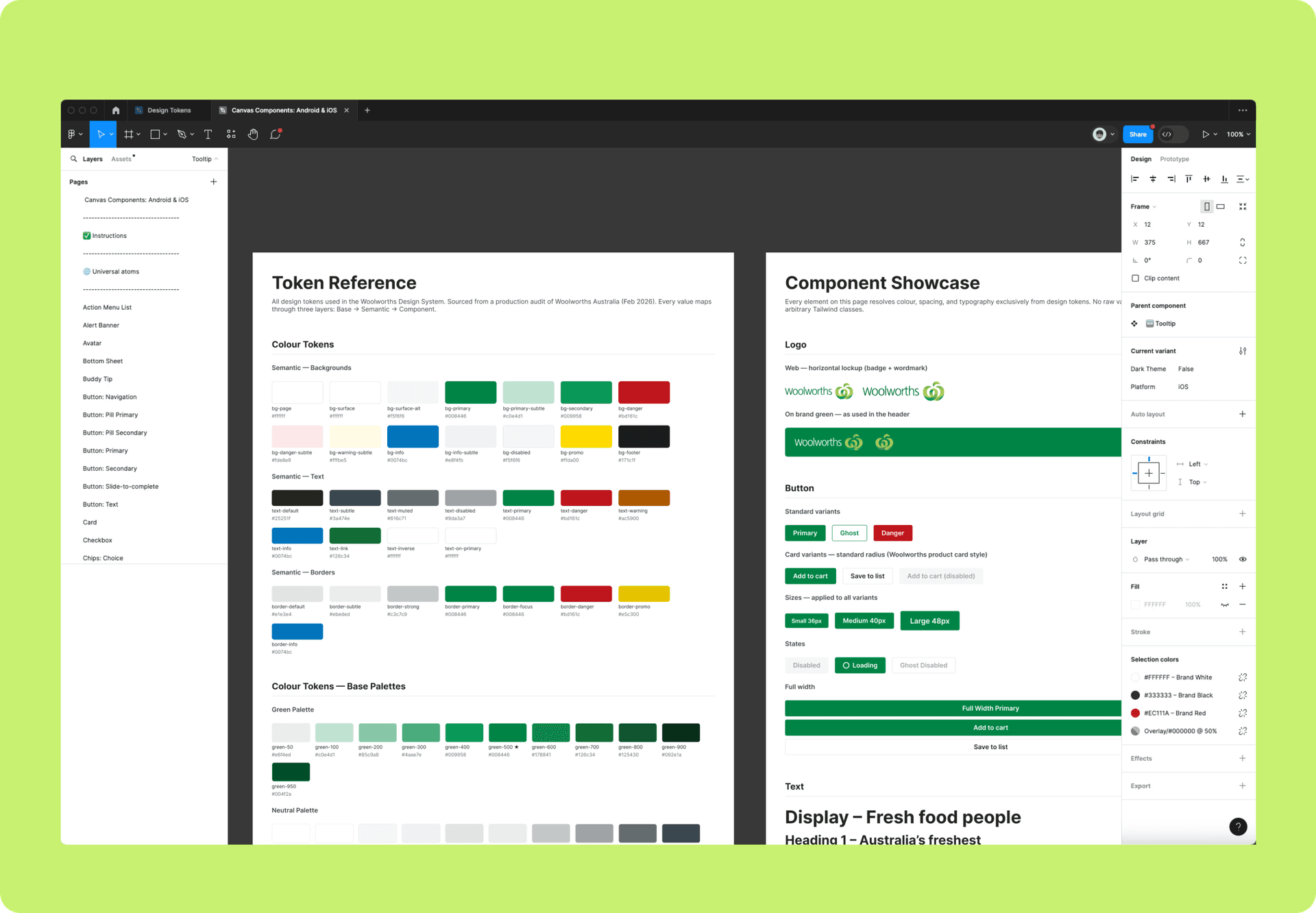
The Woolworths Design System is the shared foundation our teams build on: a library of accessible, consistent, production-ready components that lets designers and engineers ship trusted retail experiences faster, together.
Company
Woolworths
Tools
Figma, Claude Code
Role
Senior Design System Designer
Year
2026
The problem
My role
The outcome
(my role)
As senior design system designer, I shaped and maintained the Woolworths Design System across web and mobile. My work spanned design foundations and tokens, component build and governance, and the written guidelines that keep teams consistent. I partnered closely with our accessibility group to document inclusive patterns so every product ships an equivalent experience for all customers.
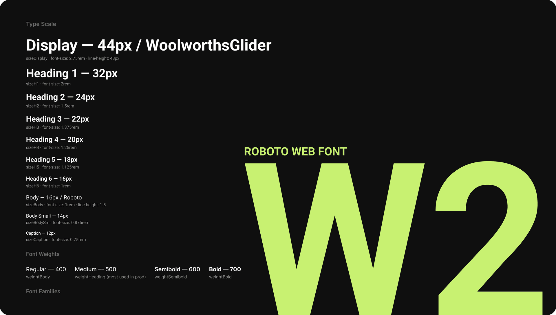
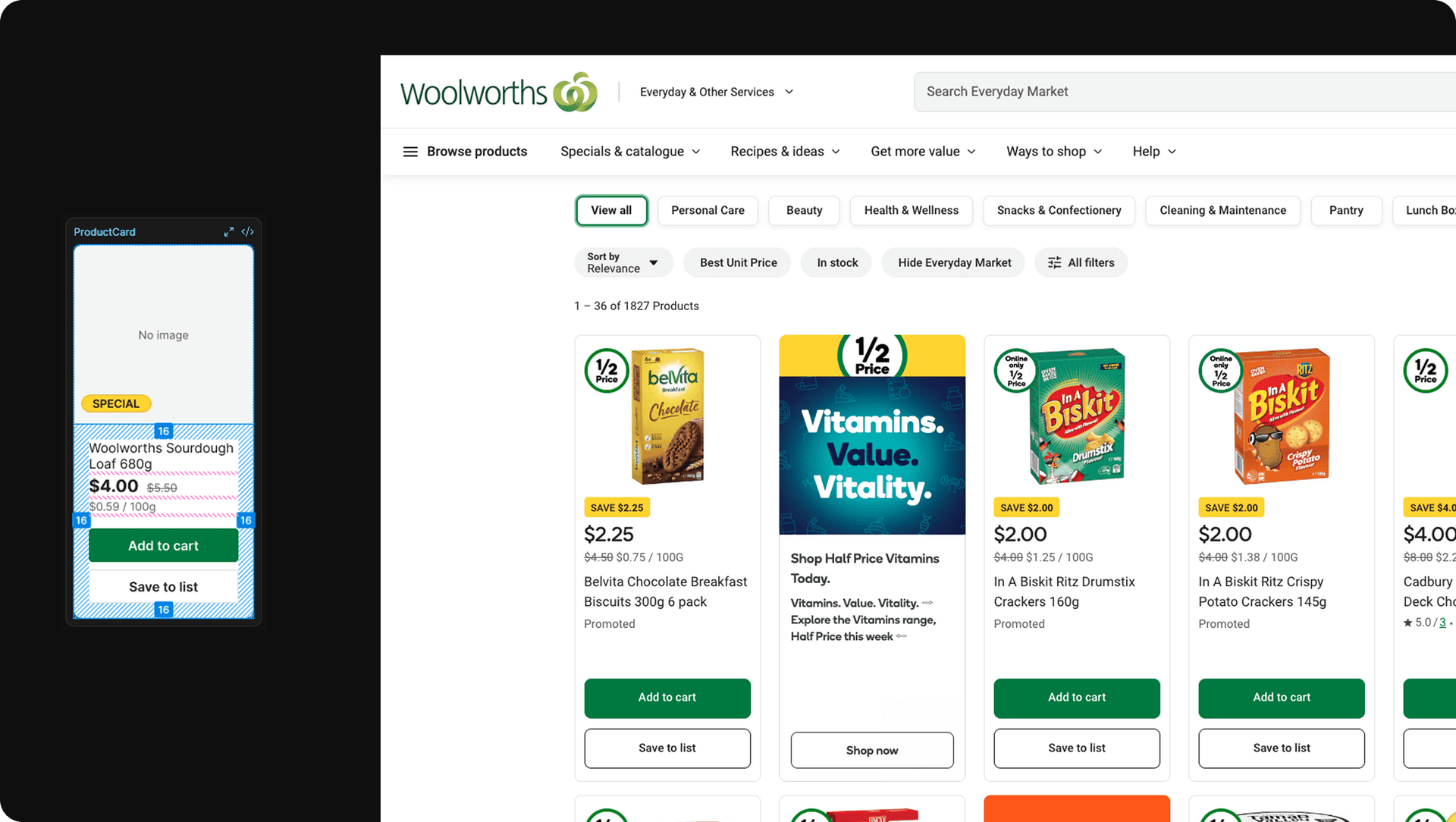
Behind the scenes…
Two libraries, one system across web & mobile
Web (React) Library
Android & iOS Library
We ship separate libraries for web (React) and mobile (iOS & Android) so each stays lean and focused on how its designers actually work. Parity between design and code is the goal: the system supports the languages Woolworths builds in, keeping one system honest across every surface.
Teams using the libraries
Coding languages supported
Components available to use
Guidelines that make the system easy to adopt
The Woolworths Design System serves designers, engineers and product managers every day. Clear documentation is what turns a component library into a system people actually reach for, so every pattern ships with guidance on when to use it, how it behaves, and where its edges are.
Each entry covers accessibility, layout, content and tone, with worked examples designers can lift straight into a file.
Inclusive by default
Colour contrast
Keyboard controls
Focus state
Annotation kit
Screen reader
Love
Woolworths reaches millions of customers, so the system has to work for all of them. Accessibility isn't a review step at the end. It's built into every component, checked against WCAG, and documented so teams inherit it for free.
Colour contrast, keyboard paths, focus states, screen-reader labels and annotation kits all ship with the component, so accessibility is the default, not the exception.
Built to scale through contribution
Collaboration flow
Component checklist
A small systems team can't cover every surface a retailer this size needs. The system grows through contribution: product teams propose patterns, we review for quality and consistency, and the best work becomes part of the shared library.
A documented flow and a component checklist keep the bar high: governance without becoming a bottleneck.
Made with the community, not for it
The system lives or dies on the relationships around it. We run open office hours, weekly syncs and a shared channel so help is always a message away.
Regular demos and onboarding keep teams close to what's shipping, and an accessibility touchpoint keeps inclusion front of mind across every squad.
Key projects
(1)
Design tokens for effortless theming
With Figma variables, tokens finally live natively in design. The system was the ideal place to adopt them. Woolworths spans several brands and themes, so a robust token structure lets us switch themes effortlessly and speeds component work across the board.
(2)
A new library for the web revamp
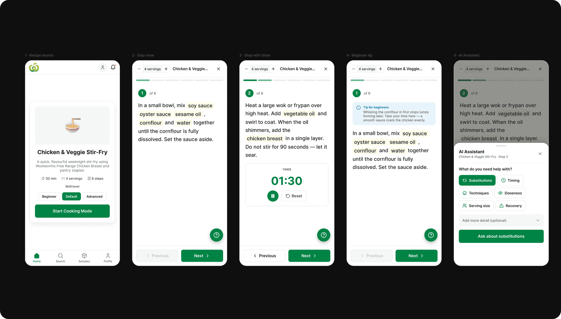
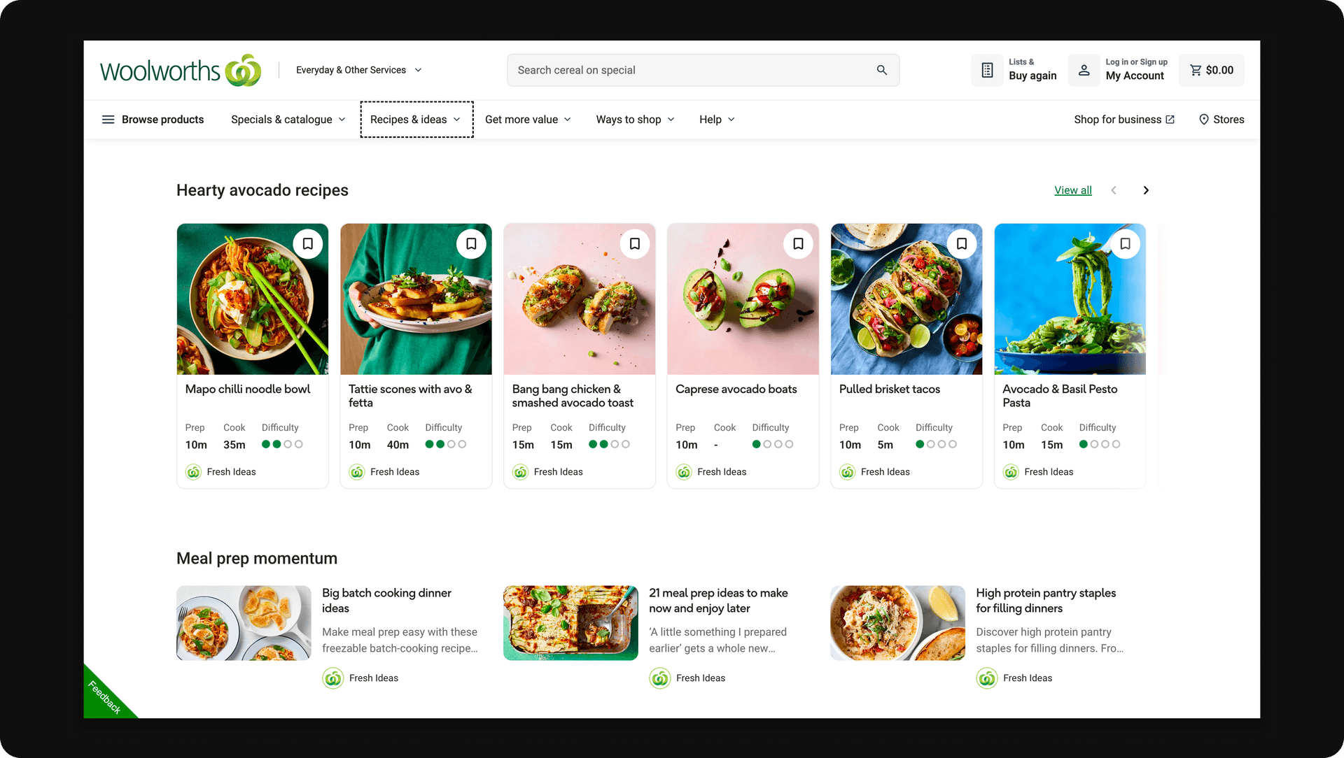
As we began revamping the retail web platform, I led a fresh library to hold the new standards on the latest framework. I built foundation, components and tokens from the ground up, and restructured the Figma files so designers can move cleanly between the core and new libraries.
(reflection)
Looking back
The components were never the hard part. The real work was earning enough trust that teams would build on a shared system instead of quietly forking their own. That trust came from showing up: office hours, fast reviews, and unblocking people before they gave up and rolled their own version.
If I started over, I'd open contribution up much sooner. For too long the systems team was the bottleneck; the library only began to scale once other designers and engineers could add to it safely, with guardrails that kept the quality bar high. A system this size is never really finished. It's something you keep tending.